
How the study worked
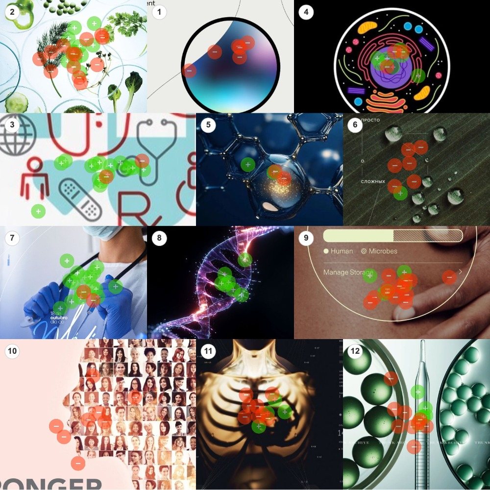
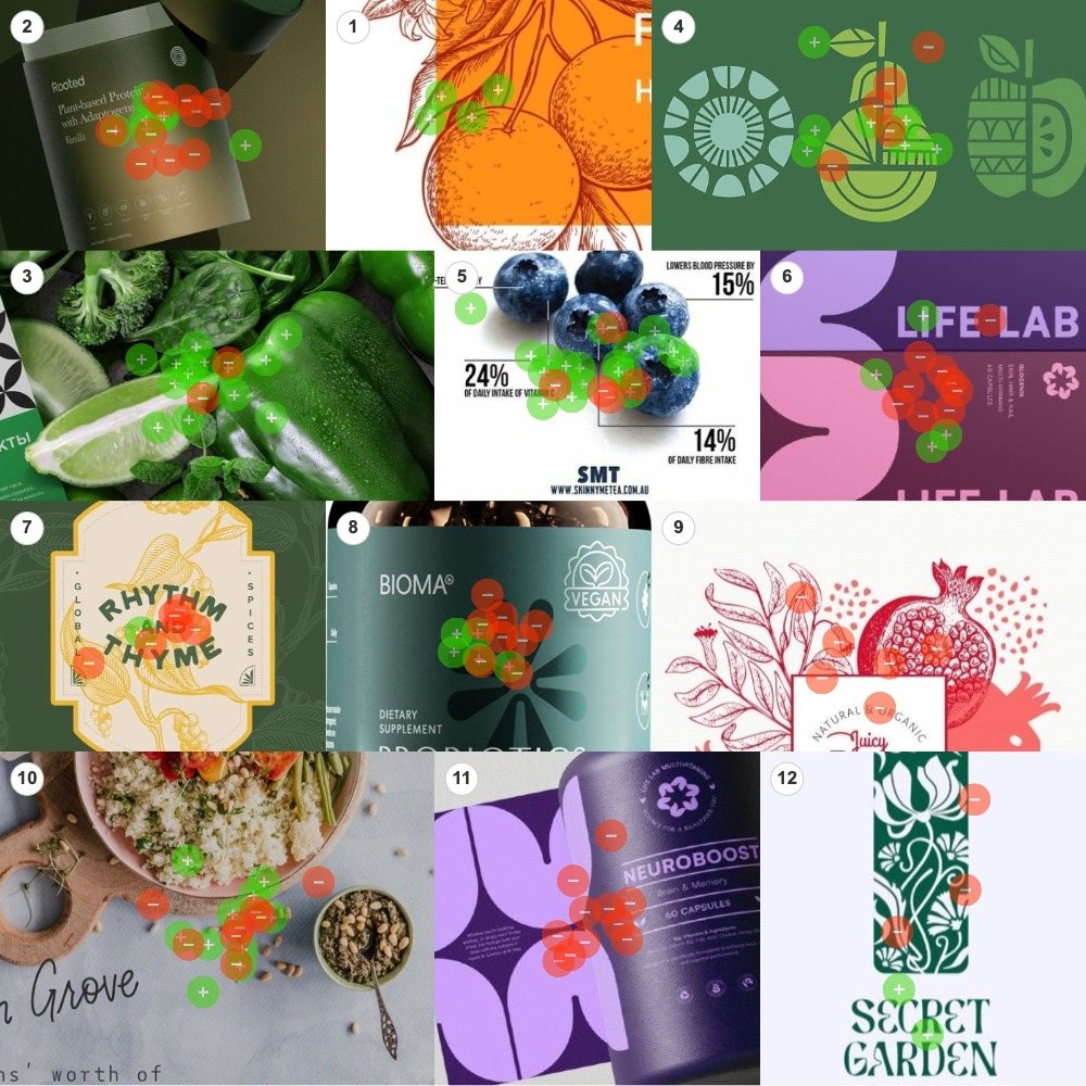
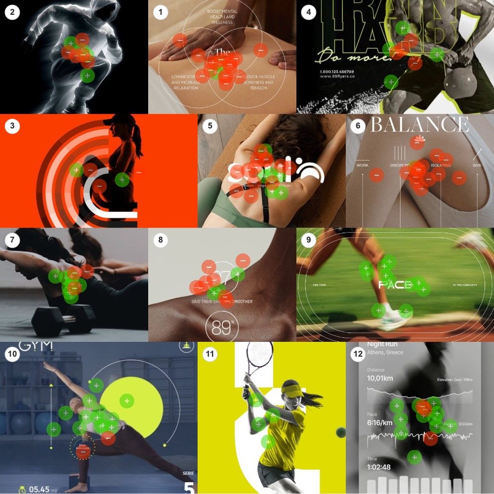
Three boards, twelve images each: Medical & Holistic, Food & Supplements, Fitness & Treatment. Twenty-six people got green dots and red dots and one prompt. Green on the images that look most like health, red on the images that look like wellness. No definition of either word was offered. That was the point.
This is not a like-or-dislike study. Both colours are honest categories, so every score on this page is a share of that image’s own crowd: an image at 100% wellness was not disliked, it was unanimously classified. At the platform’s 60% threshold, twelve images sorted to health, seventeen to wellness, and seven split the room. See the full report for every image, every count and the methodology.
The heatmaps above are the raw result before any sorting. Read them the way we read the orange juice boards: dot density is attention as well as verdict. The petri-dish greens on Board 1 drew the largest crowd in the study, 24 dots, and could not agree what they were looking at.
The line people drew
No definitions were given, and the sorting was anything but random.
Health turned out to be the measurable body. Exercise, data, doctors, and actual food. The images that went green are full of effort and evidence: a sprinter wrapped in pace graphics, a workout mid-rep, a clinician in gloves, wet vegetables, berries annotated with daily-intake percentages.
Wellness turned out to be the felt body. Rest, touch, ritual and atmosphere. The images that went red are quiet and receptive: a massage, a yoga stretch, dew on a leaf, a soft abstract orb. And, strikingly, nearly every product on the boards.
Figure 1 · The boundary, and what sits on each side
Principal finding
Health is the body doing and being measured: effort, data, medicine, food. Wellness is the body being cared for: rest, touch, atmosphere, and almost anything sold in a package. The boundary is not subject matter. It is treatment.
Health: the body doing, and being counted
Twelve images crossed the 60% threshold toward health, and they organise into three families: effort, evidence and food.
The cleanest verdict in the study is the pace runner, 11 of 11, full exertion under performance graphics. The medical establishment’s iconography sorts green with near-unanimity: the DNA helix took all seven of its dots, the icon pattern and the gloved clinician each posted 88.9% on crowds of 18. Unprocessed food is health: the wet vegetables at 88.2%, the field-guide orange at 4 of 4. The blueberries, the board’s largest crowd at 23 dots, add the study’s clearest evidentiary cue. Fruit annotated with daily-intake percentages reads as nutrition science, not marketing, and still gives up ten points to the plain vegetables. Even helpful annotation is a layer of mediation.
Health
The pace runner
Sprinting shoes, motion blur, pace graphics
100% green · 11 of 11 dotsHealth
The DNA helix
A glowing double strand
100% green · 7 of 7 dotsHealth
The tennis swing
Racquet up, chartreuse court
100% green · 4 of 4 dotsHealth
The botanical orange
Line-drawn citrus, field-guide style
100% green · 4 of 4 dotsHealth
The clinician
Mask, blue gloves, scrubs: institutional medicine
89% green · 16 of 18 dotsHealth
The medical icons
Stethoscopes, crosses and bandages in a repeating print
89% green · 16 of 18 dotsHealth
The vegetables
Peppers, lime and greens, still wet
88% green · 15 of 17 dotsHealth
The gym app
A pose framed by timers and interface markers
87% green · 13 of 15 dotsHealth
The run tracker
Distance, pace and elevation over a blurred runner
79% green · 11 of 14 dotsHealth
The blueberries
Fruit annotated with daily-intake percentages
78% green · 18 of 23 dotsHealth
The dumbbell rep
Mid-rep effort, weights in the foreground
73% green · 8 of 11 dotsHealth
The cell
A single cell rendered in vivid colour on black
70% green · 7 of 10 dotsNotice where the family thins. The cell illustration, at 70%, is scientific subject matter rendered decoratively, and it sits at the bottom of the health cluster. That is the first sign of the effect that runs the whole study: as science becomes decoration, certainty erodes.
Wellness: the body receiving
Seventeen images crossed the threshold toward wellness, the larger cluster and the more commercially structured one. Ten of them are here; the six branded products get their own section, because they are the finding.
The treatment pole mirrors the effort pole point for point. Where health’s bodies work, wellness’s bodies receive: the massage under benefit copy at 89.5%, the BALANCE editorial at 15 of 16, the yoga-mat stretch at 68.4%. Board 1 adds what might be called science’s aesthetic echo. The gradient orb and the mosaic of faces are unanimous. Dew on a leaf posts 85.7% with no body and no product in frame at all. Calm imagery alone is enough to read as wellness.
The three most instructive entries are partial migrations. A touch interface about microbes, 72.2% wellness: an app, but its data is skin-deep and sensory. An x-ray torso in golden glow, 66.7%: medical imaging, aestheticised. Capsules staged in a petri dish, 60.0%: the laboratory restyled as a spa. Scientific content does not anchor an image to health. Scientific treatment does.
Wellness
The gradient orb
A soft abstract sphere in a thin ring
100% red · 6 of 6 dotsWellness
The mosaic of faces
Hundreds of portraits composing one image
100% red · 8 of 8 dotsWellness
The BALANCE editorial
A serif headline over an annotated leg
94% red · 15 of 16 dotsWellness
The massage
Hands on a back, ringed by wellness claims
89% red · 17 of 19 dotsWellness
The droplets
Macro dew on a dark leaf, no body, no product
86% red · 6 of 7 dotsWellness
The skin interface
A fingertip on a ‘human / microbes’ slider
72% red · 13 of 18 dotsWellness
The yoga stretch
A reclining figure under a studio logo
68% red · 13 of 19 dotsWellness
The golden ribcage
An x-ray torso rendered in warm glow
67% red · 8 of 12 dotsWellness
The expectant mother
Red arcs around a maternal profile
60% red · 3 of 5 dotsWellness
The capsule dish
Green pearls and a dropper: the lab as spa
60% red · 9 of 15 dotsThe supplement surprise
The sharpest pattern in the study sits on the food board.
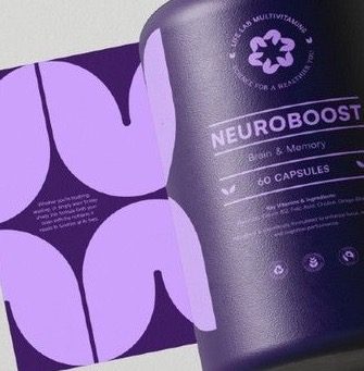
Every image of actual food leaned health: the vegetables at 88%, the blueberries at 78%, the botanical orange at 4 of 4. Every packaged product leaned wellness. Six supplement and label designs went red, two of them unanimously. The more lifestyle-forward the packaging, the more decisive the verdict: violet neuro-capsules and boutique juice at 100%, engraved spice branding at 85.7%. The more clinical-adjacent the product, the closer it sits to the line: the probiotics jar with its “dietary supplement” panel at 61.5%.
Read the blueberries and the pomegranate label together. It is fruit both times. What moves the image across the line is not the food, it is the packaging. The moment nutrition becomes a branded product, people stop filing it under health and start filing it under wellness.
Wellness
The NEUROBOOST box
Brain-and-memory supplement in violet
100% red · 11 of 11 dotsWellness
The juice label
Boutique illustrated branding in red
100% red · 6 of 6 dotsWellness
The spice label
Engraved spice branding in gold
86% red · 6 of 7 dotsWellness
The LIFE LAB boxes
Supplement boxes in purple and pink
69% red · 9 of 13 dotsWellness
The probiotics jar
Teal label, vegan badge, dietary supplement
62% red · 8 of 13 dotsWellness
The botanical mark
Art-nouveau botanical logo in deep green
60% red · 3 of 5 dotsWhy this matters
People who take supplements often believe they are making a health decision. This study suggests the public reads those same products as wellness: a lifestyle category, not a medical one. For anyone communicating about nutrition, that gap between intention and perception is the finding to sit with. And it cuts the other way too. A public-health campaign that adopts wellness aesthetics to feel approachable may be trading away the very authority that makes its guidance read as medical.
The whole study in two images
Two images drew exactly eleven dots each. One took all eleven for health. The other took all eleven for wellness. Nothing else in the study is that symmetrical, and the pair says everything.
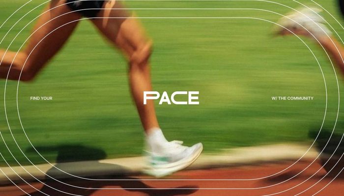
One is a body at work. The other is a product that promises to work on you. The room needed no definition to tell them apart.
The twin test: two screens full of numbers
The study’s subtler pair is two images built on data, sorted to opposite sides of the line. The run tracker documents what the body did: distance, pace, elevation. The skin panel promises how you will feel: “89% said their skin was smoother.” Identical visual grammar, circles and figures and serif restraint. Participants read past the form of the evidence to its function.
Health
The run tracker
Numbers that measure what the body did
79% green · 11 of 14 dotsWellness
The skin statistics
Numbers that promise how you will feel
73% red · 8 of 11 dotsThe number itself is not the signal. What the number is doing is.
The blurry middle
Seven images failed to reach 60% in either direction. They are not noise. They map the exact seam where the two ideas overlap, and every one of them mixes one cluster’s subject with the other cluster’s treatment.
The petri-dish greens, whole food arranged as laboratory specimens, drew the study’s largest crowd and split it 46 to 54. The protein jar is the commercially significant case: a product that speaks nutrition’s language while wearing wellness’s packaging, and the room divided accordingly. The x-ray runner fuses clinical imaging with athletic art direction and lands on a coin flip. Each of the seven is a health cue under a wellness treatment, or the reverse, and the vote records the stalemate.
Split
The petri greens
Whole food arranged as laboratory specimens
46% split · 11 of 24 dots healthSplit
The protein jar
Sold like a supplement, used like food
41% split · 7 of 17 dots healthSplit
The grain bowl
A composed lunch table from above: food under styling
56% split · 10 of 18 dots healthSplit
The x-ray runner
Medical imaging fused with athletic motion
44% split · 4 of 9 dots healthSplit
The gym poster
Exertion rendered as branding
50% split · 4 of 8 dots healthSplit
The fruit icons
Produce abstracted into graphics
58% split · 7 of 12 dots healthSplit
The molecular macro
Science as texture
50% split · 2 of 4 dots healthThe middle, in short, is where treatment fights subject. Attention predicts nothing about direction: the study’s largest crowd landed on its most evenly split image.
What to do with this
Neither category is better. But knowing which one your image signals is the difference between being heard as medicine and being heard as lifestyle. The risk is signalling one while intending the other.
Do
- Show the body working. Exertion was never misfiled. Running, lifting, playing: effort in progress is health’s anchor image.
- Let data document, not persuade. Pace, distance, daily intake. Measurements of activity sort green.
- Keep food looking like food. Raw produce spent no health credibility. Every layer of packaging, styling or abstraction spent some.
- Borrow clinical cues deliberately. Gloves, scrubs, DNA, cells. Medical authority sorts green almost without dissent, at the cost of warmth.
- If you want wellness, say so. Touch, rest, dew, glow and a package read as wellness instantly. Useful for lifestyle positioning.
Don’t
- Don’t package it and expect health. Branded objects were the study’s most decisive wellness signal, twice unanimous. Fatal for medical positioning.
- Don’t dress a feel-good claim as a statistic. “89% said their skin was smoother” sorted red at 72.7% despite its numbers.
- Don’t aestheticise the science. Golden glow, soft gradients and lab-as-spa staging moved medical subjects 20 to 40 points toward wellness.
- Don’t style the produce. Greens in petri dishes and a composed grain bowl both split the room. The plain wet vegetables did not.
- Don’t soften a public-health message with wellness aesthetics. The approachability costs authority, and on these boards the authority did not survive the glow.
Methodology and confidence
Twenty-six completions across 100 opens, 435 dots over 36 images on three boards of twelve: 147 on Medical & Holistic, 146 on Food & Supplements, 142 on Fitness & Treatment. Classified at the platform’s 60% threshold. Per-image crowds run from 4 to 24 dots, so the unanimous verdicts on small counts, the DNA helix at 7 of 7, the tennis swing and botanical orange at 4 of 4, are strong directional signals rather than settled facts. The findings that bear weight are the convergent ones: the productisation effect repeats across six independent branded objects, and the acting-versus-receiving pattern holds across every above-threshold image on the fitness board. Read the pattern, not the decimals. And remember what was measured: not what health and wellness are, but what they look like to the public.
Frequently asked questions
What was tested in the health vs wellness study?
Thirty-six images on three themed boards: Medical & Holistic, Food & Supplements, and Fitness & Treatment. Photographs, packaging, app screens, editorial layouts and illustrations, mixed together. Participants placed green dots on images that looked like health and red dots on images that looked like wellness. No definition of either word was provided, and 435 dots were placed in total.
Who took part, and is 26 people enough?
Twenty-six completions from a general U.S. audience, across 100 opens. For the architecture of the boundary, yes: the productisation effect repeated across six separate branded products and the acting-versus-receiving pattern held on every above-threshold fitness image. Individual percentages are directional, and the unanimous verdicts on crowds of four to seven dots should be read as strong signals, not statistics.
How do I read the Audience Perception Maps?
Each map is one board with every dot left where participants placed it. Green means “this looks like health,” red means “this looks like wellness.” Neither colour is approval. Dot density shows where attention went, and the colour mix on each image shows how it was classified. Every percentage on this page is a share of that image’s own crowd, printed next to the count it came from.
What does “100% wellness” mean for a supplement brand?
It means every dot placed on that image classified it as wellness rather than health. The NEUROBOOST box took 11 of 11. Nobody disliked it; they categorised it, and the category was lifestyle rather than medicine. For a brand that wants its product read as a health intervention, that is the gap to close, and packaging was the single strongest wellness cue in the study.
What does this mean for a health or wellness brand?
Decide which word you want to be heard as, then check your imagery against the cues. Effort, measurement, clinical settings and unpackaged food read as health. Rest, touch, atmosphere, packaging and feel-good claims read as wellness. The failure mode is signalling one while intending the other, and a perception study on your own creative shows which side of the line it lands on before the audience decides for you.