
How the study worked
Seventeen robot images went on a board: industrial arms, quadrupeds, humanoids at trade shows and humanoids at home. Twenty-one people in the United States each got green dots and red dots and one instruction. Drag green dots on the robots that look helpful. Drag red dots on the robots that look creepy.
The platform sorts the result at a 60% consensus threshold. An image is helpful when at least 60% of the dots it drew were green, creepy when at least 60% were red, and contested in between. Of the 17 robots the report pictures, seven cleared the bar as helpful, nine crossed it as creepy, and one split the room. See the full report.
Every number on this page is a share of that image’s own dots. Green and red are the study’s own encoding, so the verdict is written next to each score.
The one variable: tool or being
Line the 17 robots up by the share of dots they took green and they do not spread out along a friendliness scale. They sort into two piles with almost nothing in between. One pile is equipment. The other pile is company.
Figure 1 · Every robot, ranked
The winning images are obviously machines. Exposed servos, cable runs, a brushed finish, a job being done on an object. The losing images are ambiguously people. Smooth white shells, a face that is almost a face, a person-shaped thing standing in a person-shaped space. The more a design blurred the line between those two categories, the more red it took.
Principal finding
The helpful-creepy divide maps almost perfectly onto obviously a machine versus ambiguously a person. Participants are not assessing personality. They are responding to categorical ambiguity, and every design choice that softens the machine into something more like a being costs points.
What read as helpful: the arms
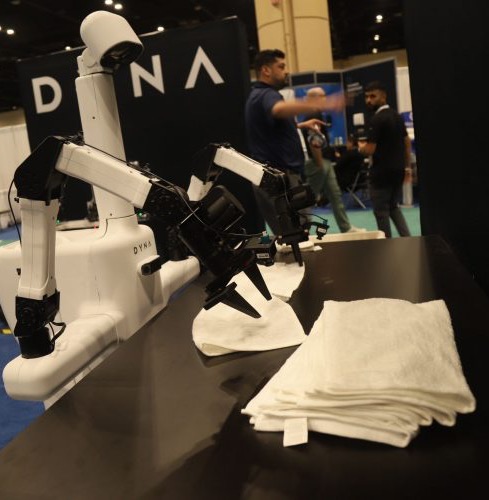
Five arm-based robots scored between 90.91% and 100% helpful, and four of them were unanimous. None has a face. None has a body. Every one of them is shown doing something to an object: welding, folding, picking, writing. Where a human appears, the human is supervising, not being served.
Resonance
The laundry arm
A Dyna arm folding towels on a trade-show table, wiring in plain view
100% greenResonance
The picking arm
Dyna arms on a warehouse line, packages moving past
100% greenResonance
The whiteboard arm
An arm writing on a classroom whiteboard, sunlight through the window
100% greenResonance
The bare mechanism
A brushed-metal arm on white, servos and wiring exposed
100% greenResonance
The welding arm
A white Panasonic industrial arm, cables trailing, on a plain ground
91% greenThe palette is white, grey, black and metallic silver. Orange appears only as a safety accent. Nothing is glossy, nothing imitates skin, and the Dyna machines make a point of showing their motors. Visible mechanism is not a flaw to be hidden here. It is the reason the room trusted them.
The exception that proves the rule
One humanoid cleared the helpful bar, and it did so in a kitchen, which is exactly where every other humanoid on the board died. Sunday Robotics’ Mamo scored 92.31% helpful serving food at a home counter, and its head alone scored 85.71%.
Look at the head. A rounded dome, an orange cap, two camera slots where eyes would go. It is a 1960s idea of a robot, and that is the whole trick. The face reads as an appliance, not an entity. Mamo never asks the viewer to decide whether it is a person, so the viewer never has to.
Resonance
The retro helper
Mamo at a home counter, a rounded 1960s dome for a head, hands on the task
92% greenResonance
The appliance face
The same head up close: orange cap, two dark camera slots, no attempt at a mouth
86% greenThat is the only humanoid strategy the data supports. If the form has to be human-shaped, make the head unmistakably a machine. Vintage futurism reads as equipment. A soft, minimal, almost-face reads as something else, and the next two sections show what happens to it.
What read as creepy: the humanoid problem
Every robot in the creepy array is humanoid, pseudo-humanoid or animal-form. Boston Dynamics’ Atlas went 100% red. Figure’s studio unit with a black visor for a face went 83.33% red. The iCub, a child’s face on a metal body, went 84.62% red. Even the Toyota partner robot playing a violin, the most obviously harmless thing on the board, took two thirds of its dots red.
The quadruped extends the pattern. A grey Unitree dog with no face at all scored 76.92% creepy. Animal form is as much of a problem as human form. The issue is not the face. It is the suggestion of a creature.
Resistance
The full humanoid
Atlas, a white chest shell over exposed hydraulics, walking toward the camera
100% redResistance
The waiter
A black-suited Figure unit carrying drinks through a social gathering
89% redResistance
The child face
iCub, a child’s face on a metal body, hand raised as if to wave
85% redResistance
The screen face
A Figure unit on a studio ground, a black visor where a face would be
83% redResistance
The dog
A grey Unitree quadruped on white, animal form without a face
77% redResistance
The performer
Toyota’s partner robot playing violin, white shell, curtained stage
67% redThe gentle-helper trap
Here is the finding that should worry a consumer robotics marketing team. Domestic settings and caregiving activities make humanoid robots more creepy, not less. A Figure unit watering a plant at a home sink scored 81.82% creepy. A 1X robot being admired by an elderly man scored 87.50% creepy. Placing a human-shaped machine in a human-inhabited room sharpens the question of what it is, and the room answered.
The fabric face is the failure mode. The 1X units with white fabric heads and two dot eyes score between 87.50% and 100% creepy. The intent is obvious: soft materials, rounded forms, minimal features, nothing threatening. The result is the strongest rejection in the dataset. Making a face softer is precisely an attempt to make it more like a being, and being-like is what people reject.
Resistance
The soft face
A 1X robot before a wall of screens, white fabric head, two dot eyes
100% redResistance
The carer
A fabric-faced 1X robot with an elderly man’s hand on its shoulder
88% redResistance
The plant waterer
A Figure unit watering a houseplant at a bathroom sink
82% redCompare the plant waterer with the whiteboard arm. Both are doing a small, useful chore. One is a machine at work. The other is a stranger in your bathroom. Same task, opposite verdict, and the only difference is the body.
The whole study in two images
The cleanest pair on the board is two robots built for the home. Both are shown in soft, domestic terms. Both were unanimous.
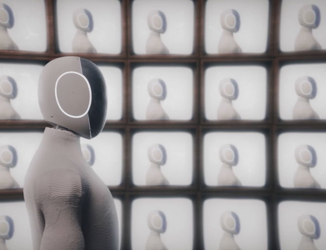
Same domestic ambition. One says equipment. The other says someone. The room needed no instruction to tell them apart.
One image split the room, and it is the one that treats humanoids as merchandise. The X1 product lineup, three fabric-faced units in grey, white and black, went 58.33% helpful and 41.67% creepy. Presented as objects for sale rather than actors in a scene, the same design reads as slightly less like a being. Slightly. It still could not clear the bar.
Contested
The product shot
Three fabric-faced X1 units in grey, white and black, framed as a catalogue lineup
58% split · 41.67% redWhat to do with this
The decision logic translates directly into product design and into how a robot is photographed. Show robots doing things, not being present. Task completion beats social context, and a technical-documentation aesthetic beats lifestyle photography every time.
Do
- Build arms and modules. Arm-based, task-specific form factors scored 90.91% to 100% helpful. Nothing else came close.
- Show the mechanism. Joints, servos, cables, brushed metal, matte finish. The Dyna machines display their motors and were unanimous.
- Use a sensor as the face. A camera lens or a retro dome reads as equipment. Mamo cleared the bar at 92.31% with exactly that.
- Photograph the work. Warehouses, trade shows, a whiteboard, a finished task. Industrial context frames the robot as a tool.
- If it must be humanoid, go retro. Vintage futurism is the one humanoid register the room accepted.
Don’t
- Don’t cover the head in fabric. Soft heads with dot eyes scored 87.50% to 100% creepy. The gentlest design on the board lost hardest.
- Don’t simulate skin. Smooth white plastic and minimal features push a machine toward being-like, and being-like is the problem.
- Don’t shoot humanoids at home. Bathrooms, living rooms and parties amplified the ambiguity: 81.82% to 88.89% creepy.
- Don’t sell the gentle companion. Caregiving and social scenes produced the strongest rejection in the study.
- Don’t default to the dog. Animal form without a specialised reason scored 76.92% creepy.
One warning before you run with this. The sample is 21 people, which the report rates as directional with moderate confidence. The patterns are consistent and internally coherent, but treat them as hypotheses to validate with a larger sample and demographic cuts before a design programme is built on them. The same mechanism, category clarity beating decoration, shows up in the orange juice study, where every layer of styling between the fruit and the picture read as distance.
Frequently asked questions
What was tested in the robot perception study?
Seventeen robot images: industrial arms from Panasonic and Dyna, humanoids from Boston Dynamics, Figure, 1X, Toyota and Sunday Robotics, the iCub, a Unitree quadruped and an X1 product lineup. Participants placed green dots on the robots that looked helpful and red dots on the ones that looked creepy.
Who took part, and how many?
Twenty-one participants in the United States completed the board in December 2025. The report classifies images at a 60% consensus threshold and rates the sample as directional with moderate confidence, so the patterns are hypotheses to validate rather than final conclusions.
How do you read the scores?
Each percentage is the share of that image’s own dots. An arm at 100% helpful drew only green dots. A fabric-faced humanoid at 100% creepy drew only red. Anything between 40% and 60% in both directions, like the X1 lineup at 58.33% helpful, is contested.
What does this mean for a robotics brand?
Sell the tool, not the companion. Visible mechanism, sensor-as-face and task-completion imagery read as helpful. Fabric faces, skin-like shells, domestic interiors and caregiving scenes read as creepy, and softening a humanoid made the rejection stronger, not weaker.