
How the study worked
Two boards, thirteen typographic images each. Every image uses some form of distress, texture or stylization: letterpress, spray paint, torn paper, chrome, neon, grunge overlays, script fonts. Nineteen creative professionals, out of 60 who opened the survey, got green dots and red dots and one prompt: when a client says make it edgy, what do you see? Green on the most edgy, red on the least.
At the 60% threshold the 26 images fall into three groups. Thirteen cleared the bar as edgy, eleven crossed it as not edgy, and two split the room. Twelve of the 26 came back unanimous, every dot one colour. See the full report for every score. What follows is what each group has in common.
The one variable that decided everything
It is not colour. Both camps use high-contrast, dark-dominant palettes. It is not attitude. The rejected array includes the words VICE, BAT FANGS and BEAUTIFUL FREAK, while the winning array includes FRIENDSHIP, LOVE, PEACE. It is not even roughness. Both camps include distressed and textured letterforms.
What separates them is the authenticity of the process that produced the distress. Every winning image shows evidence that a real physical act happened: printing, spraying, tearing, painting, collaging. Every rejected image shows texture that was applied digitally after the fact, or a pre-distressed typeface chosen to do the work the designer should have done by hand.
Figure 1 · Every image, ranked
Principal finding
People can smell the shortcut. A grunge font is not edgy. A Photoshop distress filter is not edgy. Helvetica that has been printed, physically destroyed, scanned back in and ground through post-production is. The difference is labour: real process against canned effect. Audiences detect it instantly, even if they cannot explain how.
Earned against applied, side by side
The two largest unanimous crowds in the study sit at opposite poles, and they share almost everything on the surface: loud, aggressive, high contrast, letterforms that refuse to sit still.
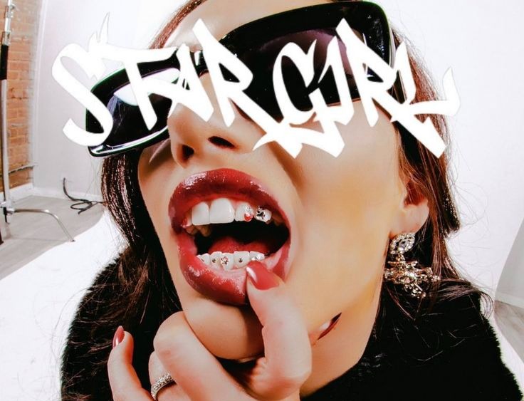
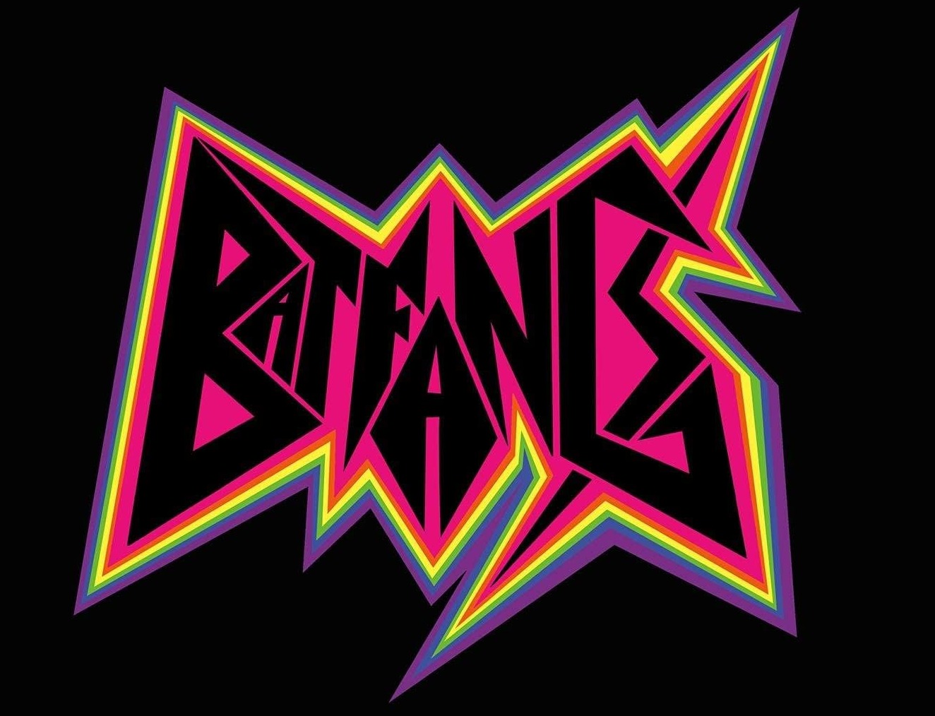
One was written by a hand. The other is a costume of edginess built from clip-art aggression, and the room rejected it without a single dissenting dot.
The same test runs through the rest of the boards. Each pair below compares a winner to a loser that shares its surface: the same general darkness, the same roughness, the same typographic energy. The difference is entirely in the craft.
Letterpress against overlay
On CULTURE the ink has bled unevenly because real pressure on real paper produces uneven bleed. The registration drifts because physical registration drifts. The red overprints the black because a second pass through the press created actual layering. On VICE ECHOES the drips are too symmetrical and the wear is uniform across the whole surface, the signature of a texture overlay at constant opacity. It reads as a filter, not a history.
Resonance
CULTURE
Letterpress, two passes, ink bleeding where the pressure varied
90% green · 9 of 10 dotsResistance
VICE ECHOES
Decorative drips, wear distributed evenly edge to edge
80% red · 4 of 5 dotsInk against a font
SOUL REBEL was hand-lettered with ink on paper. The splatter has inconsistent droplet sizes and an origin you could trace, and every letter has its own weight and angle because a hand drew each one. Calls is a retro script over a photo: uniform stroke width, mathematically consistent curves, a vintage feel that comes from colour grading and film grain rather than any vintage process. Everything is under control.
Resonance
SOUL REBEL
Hand-lettered in ink, real splatter, every letter its own weight
100% green · 8 of 8 dotsResistance
Calls
A smooth retro script set to the photograph beneath it
100% red · 10 of 10 dotsGentle words, violent execution
The words could not be less edgy. The execution could not be more so. Friendship, love and peace are hand-painted at multiple scales, crowding and overlapping, the orange paint uneven in opacity, letters intruding on each other. Bring the BOLD Back is more assertive as a sentence and less so as an object: a clean slab serif centred between two lines of script, well kerned, well balanced. A motivational poster, not a provocation.
Resonance
Friendship / Love / Peace
Hand-painted fast, in real paint, over crowded lettering
100% green · 8 of 8 dotsResistance
Bring the BOLD Back
A clean slab serif between two lines of font script
100% red · 10 of 10 dotsThe friendship proof
This pairing is the study’s most decisive evidence. Gentle words with violent execution scored 100% edgy. Assertive words with controlled execution scored 100% not edgy. Edginess lives entirely in how the letters were made, not in what they say. Content is irrelevant. Process is everything.
The three tells
Participants were not analysing production methods. They were responding to gut feel. But that gut feel is well calibrated, and when you compare the two camps at the pixel level, three kinds of evidence separate them.
Imperfection specificity
In the winners every imperfection is unique. The ink bleed on CULTURE differs on every letter because pressure, paper and ink load varied across the press. The tears on PUNK are irregular because paper tears along its grain unpredictably. In the losers, imperfections repeat. A texture applied at uniform opacity, or a brush that tiles, gives the randomness a rhythm, and the eye catches it even when the mind does not.
Process continuity
Real processes leave continuous evidence. On Go Big or Go Home the spray paint pooled at the bottom of vertical strokes because gravity pulled it while the paint was wet. Canned effects are discontinuous. The chrome on With Me has no light source you can point to. The glow on Be Your Own does not emanate from anything. There is no story of how the texture got there because no story happened.
Compositional tension
When real materials collide they create conflict. INTERNAL RIOT FAILURE has magenta type fighting the image beneath it, each partially winning. The torn poster layers grey type at conflicting scales. Digitally composited images, however aggressive, are resolved: every element placed to support every other. There is no friction because nothing actually collided.
Resonance
Go Big or Go Home
Spray paint pooling at the base of every vertical stroke
83% green · 5 of 6 dotsResonance
INTERNAL RIOT
Magenta type fighting a photographic composite
67% green · 6 of 9 dotsResonance
Torn poster
Grey type at conflicting scales, physically layered
67% green · 2 of 3 dotsResistance
With Me
Chrome script with no light source to explain it
100% red · 9 of 9 dotsResistance
Be Your Own
A glow that emanates from nothing
90% red · 9 of 10 dotsThe rest of the sort
Real process, real edge
What unites the winning array: letterpress, screen printing, spray paint, hand lettering, torn paper, ink splatter, photocopier artifacts, physical collage. The techniques vary. The principle is constant. Something real happened to produce these forms.
Resonance
PUNK
Torn red paper letters on black
100% green · 2 of 2 dotsResonance
Woodblock abstract
Rough printed letterforms, ink where the block was uneven
100% green · 8 of 8 dotsResonance
Defaced portrait
A photograph painted over by hand
89% green · 8 of 9 dotsResonance
Halftone abstract
Coarse screened letterforms, photocopier grain
86% green · 6 of 7 dotsResonance
BAD
Type printed over a photograph of a gold grill
67% green · 2 of 3 dotsResonance
CHAOS
A digital melt effect, unusual enough to half-convince
67% green · 4 of 6 dotsThe images at the lower end, all at 66.7%, have more digital intervention in their distress. CHAOS uses a glow-and-melt effect. INTERNAL RIOT FAILURE is a composite with heavy colour manipulation. They are edgier than anything in the rejected array and less convincingly physical than the top performers. The gradient from 100% to 66.7% maps almost perfectly onto the gradient from clearly handmade to hybrid.
Canned effects, dead edge
What unites the rejected array: vector illustration, 3D rendering, chrome effects, digital compositing, uniform texture overlays, pre-distressed typefaces. Every image could have been produced entirely within software without a physical step. Where distress is present, it was applied rather than generated.
Resistance
GOOD WAVES
Glossy blue bubble letters, rendered
100% red · 9 of 9 dotsResistance
BEAUTIFUL FREAK
An edgy phrase in comfortable clean sans-serif
100% red · 7 of 7 dotsResistance
overtype
A marker-style script, uniform stroke, no marker
100% red · 4 of 4 dotsResistance
DELUXE
Pink chrome 3D letters, machine perfect
89% red · 8 of 9 dotsResistance
Nothing Is Ever
Scratched brush letters, uniform white on black
67% red · 2 of 3 dotsNothing Is Ever sits at the boundary. Its hand-scratched quality is more convincing than VICE ECHOES and less convincing than SOUL REBEL. It may be genuinely hand-drawn, in which case the partial rejection comes from the uniform white-on-black execution, which flattens the layered sense of process the strongest winners carry.
The two images that split the room
We Live Our is the most instructive image on the boards: a slick editorial layout with digital type over a photograph. The content cues are edgy, a hooded figure, an obscured face, street energy. The process cues are not: clean digital typesetting, polished photography. The room split almost exactly in half. This is the fault line. When content signals edge and process signals control, people genuinely cannot agree.
Contested
We Live Our
Edgy subject, controlled typesetting
57% split · 4 of 7 dots greenContested
Urban Trash
Brush type on beige, two dots and a split
50% split · 1 of 2 dots greenWhat to do with this
The finding translates into a workflow, and the workflow is the opposite of the one most edgy briefs get. Start clean, then destroy.
Figure 2 · Two workflows
Do
- Start clean, then destroy. Set the type in a well-drawn face. Print it. Crumple it, drag it across concrete, photocopy it five times, leave it in the rain, tear it. Scan the result at high resolution. Then refine.
- Use material-specific tools. Letterpress, risograph, screen printing, rubber stamps, spray paint, India ink. Each medium produces a signature imperfection that emerges from physics, not algorithms.
- Layer real collisions. Type on one sheet, imagery on another. Tear both. Combine the fragments. Photograph the result. The tension is real because the layers were independent objects.
- Preserve the evidence. The bleed, the splatter, the registration error are not flaws. They are the proof of process that makes it edgy. Do not clean them up.
Don’t
- Don’t pick a grunge font. Pre-distressed typefaces are the most efficient way to signal that you did not do the work. The distress is identical every time you type a letter.
- Don’t overlay a texture. A grunge layer at 20% opacity across the whole composition reads as a filter. Real distress is local and varies across the surface.
- Don’t reach for chrome, glass or 3D. Glossy digital surfaces are the strongest anti-edgy signal in the data: With Me, GOOD WAVES and DELUXE all rendered, all rejected.
- Don’t stack signifiers. Neon plus spiky plus aggressive plus rainbow is a Halloween costume of edgy. One physical process beats ten assembled references.
- Don’t put edgy words in safe type. BEAUTIFUL FREAK in a clean sans-serif scored 100% not edgy. The word cannot do what the letterform must do.
The deeper principle
There is no substitute for the work. You cannot download edge, select it from a font menu or apply it as an action. Audiences carry a deeply calibrated, largely unconscious ability to tell things that were made from things that were assembled. When a client says make it edgy, they are asking for evidence of a process. They just don’t know that yet. Now you can show them.
Methodology and confidence
Nineteen completed dot-drag surveys across two boards of thirteen typographic images each, 26 in total, 60 opens, classified at a 60% threshold. Per-image crowds ran from 2 to 11 dots, so individual scores are directional. With n = 19 the findings are strong directional signals rather than settled consensus.
What raises confidence is the shape of the result: the pattern held on both boards independently, and twelve images came back unanimous, which is unusual for a nineteen-person panel. A larger sample of 40 or more would firm the numbers and allow demographic segmentation. The obvious follow-up is a controlled pair, the same typeface and layout produced once physically and once digitally, to isolate the process variable from colour, composition and legibility.
Frequently asked questions
What was tested in the Edgy study?
26 typographic images across two boards of thirteen, every one of them using some form of distress, texture or stylization: letterpress, spray paint, torn paper, chrome, neon, grunge overlays, script fonts. Nineteen creative professionals placed green dots on the images they found most edgy and red dots on the least, sorted at a 60% threshold.
What does “100% green” actually mean?
It means every dot placed on that image was green. STARGIRL drew 10 dots and all 10 were green. The figure is a share of that image’s own crowd, not of all 19 participants, so an image with two dots and an image with eleven can both read at 100%, and the note beside each score tells you which is which.
Why does a grunge font score as not edgy?
Because its distress repeats. Every time you type a letter the same wear appears in the same place, and the eye registers the rhythm even when the mind does not. Real distress is local, specific and non-repeating, because a physical event produced it. Participants read the difference instantly without being able to name it.
Is nineteen people enough to act on?
For the direction, yes. Twelve of the 26 images came back unanimous and the pattern held on both boards independently. For any single image the crowd is 2 to 11 dots, so treat individual scores as directional and confirm with a larger panel before betting a campaign on one swatch.
What does this mean for my brand?
If the brief says edgy, budget for a physical step: print, destroy, capture, refine. Do not budget for a font. The words can be as gentle as friendship, love, peace and still read as edgy if the letters were genuinely made. And if your audience is not designers, run the board again with them, because this panel was.