
How the study worked
Six boards of twelve images each, one per dimension of the film’s production design: what Zelda should look like, what Link should look like, what Ganon should look like, which supporting heroes and villains should appear, and what styles should guide the movie. The images span every era of the franchise, official art, game captures and fan illustration, from the 1986 original to Tears of the Kingdom.
Thirty participants completed all six boards, out of 138 who opened the study, each placing green dots on the images they wanted to see in the film and red dots on the ones they did not. The platform sorts the result at a 71% threshold: an image is resonant when at least 71% of its dots were green, resistant when at least 71% were red, and contested in between. See the full report.
Every number on this page is a share of that image’s own dots, printed beside the share of the board’s attention it drew. Green and red are the study’s own encoding, so the verdict is written next to each score.
The finding: Ocarina of Time, grown up
Across all six boards, participants converge on one visual thesis. The film should look and feel like Ocarina of Time grew up: the characters, locations and narrative grammar of the N64 era, rendered in a painterly realism that reads as mature without tipping into grimdark. Not Breath of the Wild’s open-world ambiguity. Not Twilight Princess’s cinematic posturing. The specific story of Ocarina, painted like a Frazetta or a Ghibli background in oil.
Figure 1 · Six boards, one film
The convergent signal is not darkness versus light or realism versus stylisation. It is narrative specificity. The resonance arrays map almost perfectly onto a single Ocarina playthrough: young Link at the Deku Tree, adult Zelda before the Triforce, Ganondorf as the Gerudo King, Saria in the forest, Majora’s Mask as the sequel hook. Participants were not picking a vibe. They were casting a film.
Principal finding
This audience distinguishes clearly between the game they want to play and the game they want to watch. Open-world exploration is a gameplay experience, not a cinematic one. Linear narrative with strong character relationships and a mythological through-line is what they want from a film, and Ocarina of Time is the entry that delivers it. The production’s biggest risk is treating this as a Breath of the Wild movie.
Zelda: a woman who could address a war council
The highest-scoring Zelda is not from Ocarina at all. It is a Twilight Princess portrait at 92.31%, and the apparent contradiction reveals the real logic. What unites the four resonant Zeldas is not game era but visual maturity: detailed armour and ornament, composed posture, a palette of golds and warm earth tones. Every winning Zelda is rendered as a woman who carries political weight, not a girl on an adventure. The tiara with the red gem is constant across all of them.
The rejections tell the sharper story. Wind Waker’s Tetra is the single most rejected image in the entire study at 95% red, and it also drew the most attention on its board, 13.07% of every dot placed. Bright, rounded, chibi-proportioned, winking. Participants are saying this is not a children’s movie. The dragon-form Zelda from Breath of the Wild went 82.35% red: nominally from the most popular game, but abstract, non-human, and unrecognisable as Zelda without the lore.
Resonance
The Twilight Princess portrait
Dark, painterly, armoured, composed: a queen in gold and earth tones
92% green · 8.5% of the board’s dotsResonance
The radiant form
A luminous white dress against darkness, ceremonial gravitas
75% green · 7.84% of the board’s dotsResonance
The harp
Adult Ocarina Zelda with harp, crown, Triforce earrings and shoulder armour
75% green · 5.23% of the board’s dotsResonance
The royal Zelda
Adult Ocarina Zelda in full royal incarnation, gold on gold
72% green · 11.76% of the board’s dotsResistance
Tetra
Bright, rounded, chibi-proportioned, winking. The most rejected image in the study
95% red · 13.07% of the board’s dotsResistance
The dragon Zelda
Zelda as a light dragon: abstract, non-human, unrecognisable without the lore
82% red · 11.11% of the board’s dotsResistance
The Skyward Sword Zelda
Watercolour lightness and a casual posture, the character’s chronological origin
82% red · 7.19% of the board’s dotsThe unspoken rule is a recognisability threshold. Zelda must look like Zelda: pointed ears visible, tiara present, regal bearing, human proportions detailed enough to exist in a live-action frame. Anything that pushes her toward cartoon, abstraction or childishness is rejected, however beloved its source game. The action-capable warrior Zelda with light arrows narrowly missed the bar at 68.75%, and the young Ocarina Zelda drew the most even split on the board at 57.14%, which is a warning about child-Zelda flashbacks.
Link: the moment before the hero
The only image in the entire study to take 100% green is a painterly young Link standing before the Deku Tree’s entrance, Navi glowing ahead of him. Not one participant placed a red dot. And the image is not heroic. His back is to the viewer. He is small against the forest. The palette is deep green and fog. The mood is uncertain, even lonely, and Navi’s glow is the only warmth in it.
Participants chose that over every battle-ready, sword-drawn alternative on the board. They do not want a Link who is already a hero. They want the moment before he becomes one. For a film, that is a gift: permission to start quiet and earn the spectacle. It is also the most Ocarina-specific image in the set, green tunic, Kokiri Sword, Navi, the Deku Tree’s cavern. The audience is not choosing a vibe. They are choosing a scene, and telling the production where the film should begin.
The rejections are categorical. The Hero’s Shade at 88.24% red and Dark Link at 86.67% red. Participants want Link, not anti-Link, however loud the fan discourse about a dark Link has been. And every official Breath of the Wild and Tears of the Kingdom Link landed in the contested middle, with the Zonai-armoured Link nearly resistant at 64.29% red. The franchise’s most commercially successful design splits the room when the question is a film.
Resonance
Young Link at the Deku Tree
Back to camera, small against the forest, Navi the only warmth. Every dot green
100% green · 7.6% of the board’s dotsResonance
The painterly adult Link
Twilight Princess Link in oil-painting texture, weathered and composed
71% green · 4.09% of the board’s dotsResistance
The Hero’s Shade
The ghost of the Ocarina Link, skeletal and decayed. The audience has no interest in the afterlife
88% red · 9.94% of the board’s dotsResistance
Dark Link
Black silhouette, red eyes. A fan favourite online, rejected on the board
87% red · 8.77% of the board’s dotsContested
The photoreal Link
A realistic render of the classic tunic. Intriguing, not yet convincing
62% split · 37.5% redContested
The BOTW official Link
The bestselling game’s hero, looking out over Hyrule. Split when the question is a film
67% split · 33.33% redContested
The Zonai Link
Tears of the Kingdom’s Zonai-armoured Link, nearly resistant
36% split · 64.29% redThe photorealistic Links sit tantalisingly close to the line at 62.5% and 66.67% without crossing it. Participants are intrigued by realistic rendering but not yet convinced by any execution they have seen. That is an opening for the production, not a reference.
Ganondorf: the man, not the pig
Ganondorf’s board produced the clearest consensus of any character. The top two images, a Twilight Princess portrait at 95.45% and the Tears of the Kingdom Demon King at 93.33%, are the study’s highest-scoring character images outside the unanimous young Link, and they share one feature: Ganondorf as a recognisably human antagonist. Green-grey skin, red hair, jewelled crown, yellow eyes, ornate Gerudo armour. A person you could cast an actor to play.
The other 100% in the study is the pig-form Ganon from the original Legend of Zelda, and it is total rejection. The painterly pig Ganon went 71.43% red. The Tears of the Kingdom dragon form went 85.71% red. Non-human transformations of main characters are categorically rejected for a film. Beast Ganon has been the franchise’s final boss since 1986; the audience is saying the climactic confrontation should be with the man. The one beast image that cleared the bar, at 76.47%, reads as a brief climactic event, not the form audiences spend time with.
Resonance
The Twilight Princess portrait
Extreme facial detail: green-grey skin, red hair, jewelled crown, yellow eyes
95% green · 12.94% of the board’s dotsResonance
The Demon King
Muscular, crimson mane, a dynamic pose. Physical presence overrides era
93% green · 8.82% of the board’s dotsResonance
The Ocarina Ganondorf
The most normal depiction on the board: a man in dark armour
80% green · 11.76% of the board’s dotsResonance
The beast, briefly
The one non-human form that cleared the bar, accepted as a climactic event
76% green · 10% of the board’s dotsResistance
Pig Ganon, 1986
The original game’s crude blue pig. Not a single green dot
100% red · 8.82% of the board’s dotsResistance
The dragon Ganon
The demon dragon in red and black. Transformation rejected
86% red · 8.24% of the board’s dotsResistance
Phantom Ganon
The horned spectre from Ocarina’s Forest Temple
78% red · 5.29% of the board’s dotsContested
The Wind Waker king
One of the franchise’s best-written Ganondorfs, nearly rejected on the visual alone
29% split · 70.59% redThe Wind Waker Ganondorf is the cautionary plate. It is one of the most critically praised characterisations in the series, a weary king who lost everything, and it sits at 70.59% red. Narrative complexity is welcome. The visual treatment still has to meet the mature, painterly standard the winners set.
The supporting cast: Saria, Marin, the Deku Tree, and not the Champions
The supporting-hero winners are strikingly intimate. No Champions. No warriors. No one with a weapon. Saria, a Kokiri child with a fairy, at 84.62%. Marin, the gentle islander from Link’s Awakening, at 80%. The Great Deku Tree, a paternal guardian, at 77.78%. All three are defined by their emotional relationship to Link rather than their usefulness in a fight.
Saria at the top of this board, combined with the unanimous young Link at the Deku Tree, is the study’s strongest single narrative signal. The audience wants the Kokiri Forest prologue: the childhood friendship, the bittersweet departure. Marin is not even from Ocarina, and her inclusion sharpens the point. Participants are choosing emotional specificity over lore accuracy.
Tingle is the only character to reach the resistance threshold, at 84.62% red, and the note extends past him: comic relief that breaks the tonal register is unwelcome. And every Breath of the Wild and Tears of the Kingdom character lands in the contested middle or below. Daruk at 55.56%, Rauru at 46.67%, Purah at 33.33%. Urbosa came closest at 70%, one point under the line. The ensemble from the franchise’s biggest-selling games does not belong in this film’s first chapter.
Resonance
Saria
A Kokiri child with a fairy: the childhood friendship the audience wants
85% green · 7.65% of the board’s dotsResonance
Marin
The islander from Link’s Awakening, chosen for feeling over lore
80% green · 8.82% of the board’s dotsResonance
The Great Deku Tree
The paternal guardian, painted mossy and vast
78% green · 10.59% of the board’s dotsResistance
Tingle
Proportions, costume and expression all signal joke. This audience is not looking for jokes
85% red · 7.65% of the board’s dotsContested
Urbosa
The Gerudo Champion, one point under the line. The archetype has potential without BOTW’s narrative
70% split · 30% redContested
Daruk
The Goron Champion, and no consensus enthusiasm
56% split · 44.44% redContested
Purah
Tears of the Kingdom’s researcher, two thirds red
33% split · 66.67% redVillains and style: the mask, the crest and the Zonai problem
Supporting villains: a sequel hook and atmospheric threats
Majora’s Mask is the highest-scoring villain at 86.96% and the most-attended-to item in the villain set, 13.86% of every dot on the board. It is not from Ocarina. It is the sequel’s antagonist, and its presence in the winners suggests participants are already thinking about franchise continuity. The mask reads as an artifact, not a character, which makes it a cinematic tease that costs nothing to set up. The Darknut at 80% and the Poe at 75% are enemy types, not named villains: atmospheric threats that belong in the world.
Vaati from The Minish Cap took 100% red. Villains from the franchise’s obscure entries have no place here. Zant, from an otherwise well-scoring Twilight Princess, went 80% red: the tall helmet, the insectoid posture and a convoluted plot read as too esoteric. Participants want villains who are immediately legible or iconically mysterious. Zant is neither.
Resonance
Majora’s Mask
Hand-carved, polychromatic, enormous hypnotic eyes. An artifact, not a character
87% green · 13.86% of the board’s dotsResonance
The Darknut
An armoured enemy type, a threat that belongs in the world
80% green · 9.04% of the board’s dotsResonance
The Poe
A lantern-carrying ghost from Ocarina’s fields
75% green · 4.82% of the board’s dotsResistance
Vaati
The Minish Cap’s sorcerer. Not a single green dot
100% red · 5.42% of the board’s dotsResistance
Zant
Tall helmet, insectoid posture, a Twilight Realm plot. Too esoteric
80% red · 12.05% of the board’s dotsStyle: heraldry over technology
Neither style winner depicts a character, a scene or a place. Both are heraldic symbols: the elaborate Hyrule crest at 87.5%, gold on dark green, ringed with lore, almost an illuminated manuscript; and the Sheikah Eye at 80%, the one Breath of the Wild element that consistently scores well because it reads as rune and glyph, part of Hyrule’s deep history. Participants want a film that feels like it has its own mythology, predating the story being told.
The Divine Beast symbols went 90.91% red. Flat, graphic, closer to corporate icons than mythological artifacts. Participants want the mystical Sheikah, not the technological Sheikah. The Wind Waker tapestry, one of the most accomplished pieces of visual storytelling in the franchise, went 75% red for the same reason Tetra did: too flat, too naive, too childlike for a film. And the Zonai aesthetic, Tears of the Kingdom’s defining visual contribution, was the most-attended-to image on the style board and 70% red.
Resonance
The Hyrule crest
Gold on dark green, ringed with iconography. An artifact from inside the world
88% green · 9.3% of the board’s dotsResonance
The Sheikah Eye
Ancient, geometric, mysterious. The one BOTW element that consistently wins
80% green · 5.81% of the board’s dotsResistance
The Divine Beast symbols
Flat, graphic, UX-clean. The technological Sheikah, rejected
91% red · 6.4% of the board’s dotsResistance
The Wind Waker tapestry
Woodcut folk art, charming in a game prologue, too flat for a film
75% red · 6.98% of the board’s dotsContested
The Zonai pattern
Tears of the Kingdom’s signature look, the most-watched image on the board
30% split · 70% redThe distinction the production needs: a glowing rune carved in stone reads as mythological. A glowing circuit board reads as science fiction. This world should run on belief, sacrifice and song, not on machines.
The whole study in two images
The two unanimous verdicts on the character boards are the study in miniature. One is a boy who has not become anything yet. The other is a monster the franchise has kept for forty years.
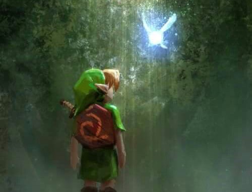
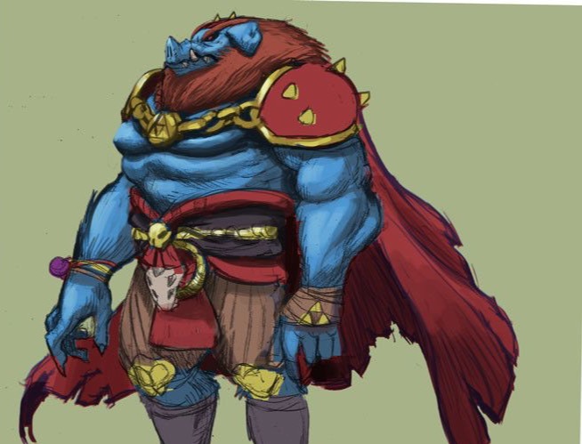
One is the moment before heroism. The other is a creature. The audience wants the man behind Ganon and the boy before Link, and it wants both painted, not rendered.
The decision logic translates directly into production notes, and the report sets them out as a synthesis rather than a single-source adaptation: Ocarina’s narrative, Twilight Princess’s visual maturity, Breath of the Wild’s sense of scale, and none of its story.
Do
- Build from Ocarina of Time. Kokiri Forest, the Deku Tree, adult Zelda, a human Ganondorf, Saria. The winners map onto its first act.
- Paint it. Painterly realism, warm earth tones, gold as the accent. Concept art come to life, not a game at higher resolution.
- Cast a physical Ganondorf. Face, expressions, Gerudo ornament. The two winning portraits are a man an actor could play: 95.45% and 93.33%.
- Start quiet. The unanimous image is melancholic and small. Open with intimacy and earn the spectacle.
- Tease Majora’s Mask. The highest-salience villain image at 86.96% is a sequel hook that costs nothing to set up.
- Root the world in heraldry. The Hyrule crest and the Sheikah Eye won the style board. Ancient magic, carved in stone.
Don’t
- Don’t make it a Breath of the Wild movie. Its Links, Champions, enemies and Zonai aesthetic all landed contested or rejected.
- Don’t go cute. Tetra at 95% red and the Wind Waker tapestry at 75% red. This is not a children’s film.
- Don’t linger on transformations. Pig Ganon 100% red, dragon Ganon 85.71%, dragon Zelda 82.35%. The man, not the monster.
- Don’t cast a designated comic. Tingle at 84.62% red. Humour has to come from relationships, not a character whose job is to be ridiculous.
- Don’t borrow Twilight Princess’s tone. Its palette and costume detail won. Its grimdark self-seriousness is not what the winners feel like.
- Don’t show ancient technology. Divine Beasts at 90.91% red. Runes, not circuit boards.
One caution from the report. Thirty completions from 138 opens is a 21.7% completion rate, and at n=30 the findings are emerging patterns, not verdicts. The convergence across six independent boards is what gives them weight; individual scores near the 71% line should be validated with a larger sample before a production decision hangs on them. The mechanism itself, an audience sorting into a specific answer it could never have written as a brief, is the same one that ran through the orange juice study and the make-it-pop study.
Frequently asked questions
What was tested in the Zelda movie study?
Seventy-two images across six boards of twelve: Princess Zelda, Link, Ganondorf, supporting heroes, supporting villains and visual style. The images span every era of the franchise, official art, game captures and fan illustration. Participants placed green dots on what they wanted to see in a live-action film and red on what they did not.
Who took part, and how many?
Thirty participants completed all six boards, out of 138 who opened the study, in October 2025. The report sets the array threshold at 71% and treats the results as emerging patterns whose strength comes from convergence across six independent boards rather than from sample size.
How do you read the scores?
Each percentage is the share of that image’s own dots. Young Link at the Deku Tree at 100% green drew no red dots at all. Pig Ganon at 100% red drew no green. The second number on each plate is salience, the share of all the dots on that board the image attracted, which measures attention rather than approval.
Why did Breath of the Wild do so badly if it is the bestselling game?
Because the question was a film, not a game. Every official Breath of the Wild and Tears of the Kingdom Link landed in the contested middle, the Champions fell short of consensus, and the Zonai aesthetic went 70% red. Open-world exploration is a gameplay experience. The audience wants linear narrative with strong relationships, which is Ocarina of Time.
What does this mean for a studio, or for any brand?
The commercially obvious option is not always the one the audience wants, and the audience cannot tell you that in a survey because it does not know it is holding a preference. Put the options on a board and the preference shows up as a pattern. Here it showed up as a cast list, a storyboard and a colour grade.