
How the study worked
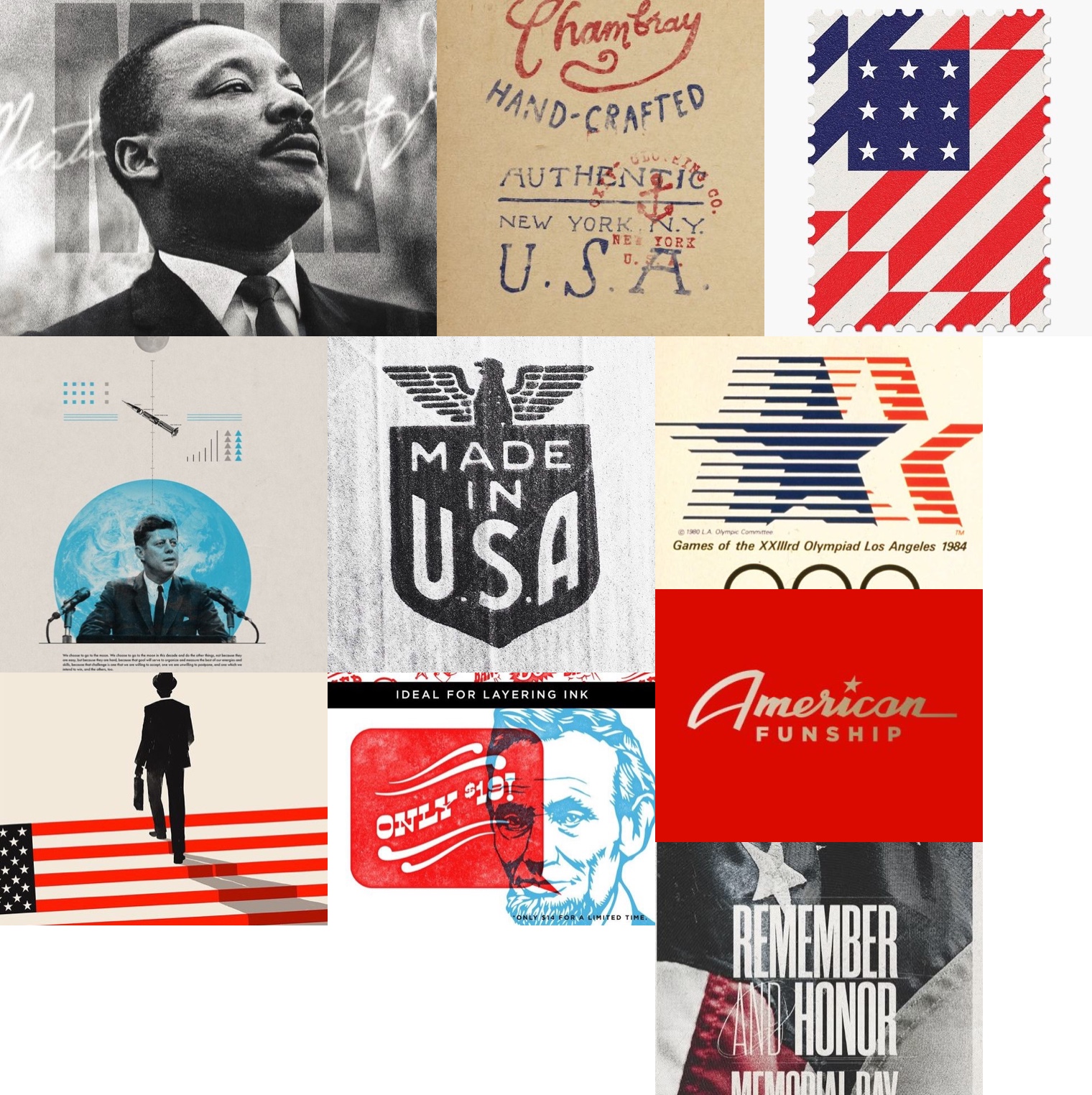
Three Audience Perception Maps, twelve images each. Posters, packaging, editorial layouts and cultural ephemera, sourced from Pinterest searches for terms like “America branding” and “American graphic design,” spanning the overtly patriotic to the merely decorative. Fifty-seven people got green dots and red dots and one prompt: green on the images you most associate with “American,” red on the images you least associate with it.
The test went to a general audience without demographic segmentation, distributed mainly through LinkedIn on June 27, 2025. At the 75% threshold the 36 images sort into three constellations: eleven resonant, eleven resistant, and fourteen that split the room. See the full report for the complete semiotic analysis.
The dividing line is purpose, not style
Line all 36 images up by the share of dots they took green and the first thing you notice is what does not sort them. The geometric flag stamp is pure abstraction: flat colour, diagonal planes, no texture. The Chambray maker’s mark is weathered, typographically irregular, materially specific. Both score above 87%. The 1984 Olympics mark is kinetic Swiss-influenced modernism and shares the winning column with distressed industrial badges and commemorative portraiture.
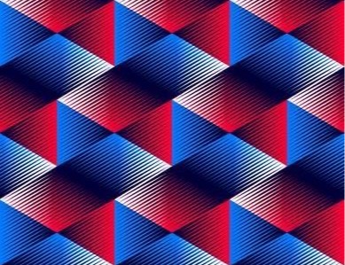
Colour does not sort them either. Red, white and blue saturate the rejected images as heavily as the accepted ones. The single most rejected image in the study is a red-white-blue geometric pattern.
Figure 1 · Every image, ranked
What the two ends share is not a look. It is a job. Participants were not responding to formal qualities; they were responding to what the image is for. A clean modernist stamp reads as American because stamps are American civic infrastructure. A weathered maker’s mark reads as American because it certifies domestic production. The purpose, not the aesthetic, carries the meaning.
Principal finding
“American” is not a fixed aesthetic category. Audiences still recognise the difference between standing for something and selling something. Civic symbols retain perceptual gravity. Consumer branding does not, even when it borrows the same stars, stripes and typography.
What resonated: standing for something
Eleven images cleared the 75% resonance threshold, and they cohere around civic, commemorative and institutional functions. Three families dominate.
Historical figures as national monuments. Martin Luther King Jr. at 97.4% and John F. Kennedy at 95.0% appear not as biographical portraits but as symbols of national ideals, the one rendered with his signature and a flag overlay, the other set against the Earth itself in a moon-speech composition. Lincoln arrives in illustrative form at 91.3%. These are not depictions of people. They are depictions of what those people represent in collective memory.
Government and civic marks. USPS stamps account for several of the strongest performers, the geometric flag abstraction at 97.2% and the chevron heart design at 75.0%. The 1984 LA Olympics logo at 76.0% represents America in international civic competition. The Made in USA industrial badge at 93.8% carries the weight of certification. These images derive their American-ness from institutional origin, not visual style.
Commemoration and provenance. The Memorial Day typography at 90.9% and the hand-crafted NYC maker’s mark at 87.5% point backward, honouring sacrifice and certifying authentic origin. They position America as something with a past worth remembering, not a brand to be promoted.
Resonance
The MLK portrait
Black and white, flag overlay, signature
97% greenResonance
The flag stamp
Stars and stripes as flat geometry, on a USPS stamp
97% greenResonance
The JFK moon speech
Space-age commemorative collage
95% greenResonance
The Made in USA badge
Industrial eagle badge, the weight of certification
94% greenResonance
The Lincoln illustration
Retro typography over a two-colour portrait
91% greenResonance
The Memorial Day poster
Remember and Honor typography
91% greenResonance
The Chambray mark
Weathered NYC maker’s mark, hand-crafted, authentic
88% greenResonance
American Funship
Retro script on red. The one commercial winner
86% greenResonance
The flag stairs
A businessman climbing the flag: the aspiration motif
82% greenResonance
The 1984 Olympics mark
Stars in motion, Swiss-influenced modernism
76% greenResonance
The USA 33 stamp
Geometric chevrons with a heart motif
75% greenThe outlier
American Funship at 86.4% is explicitly commercial: cruise-line branding. It scored with the monuments anyway. Participants may not have recognised the contemporary Carnival brand, reading the retro script and solid red field as a mid-century artefact instead. Or the word “American” in the name overrode the commercial context. Either way it is the exception that shows the rule: it won by looking like something that stood for something.
What was rejected: selling something
Eleven images crossed the 75% resistance threshold. They use the same vocabulary as the winners, stars, stripes, red, white, blue, vintage type, and deploy it toward different ends. Four failure modes emerge.
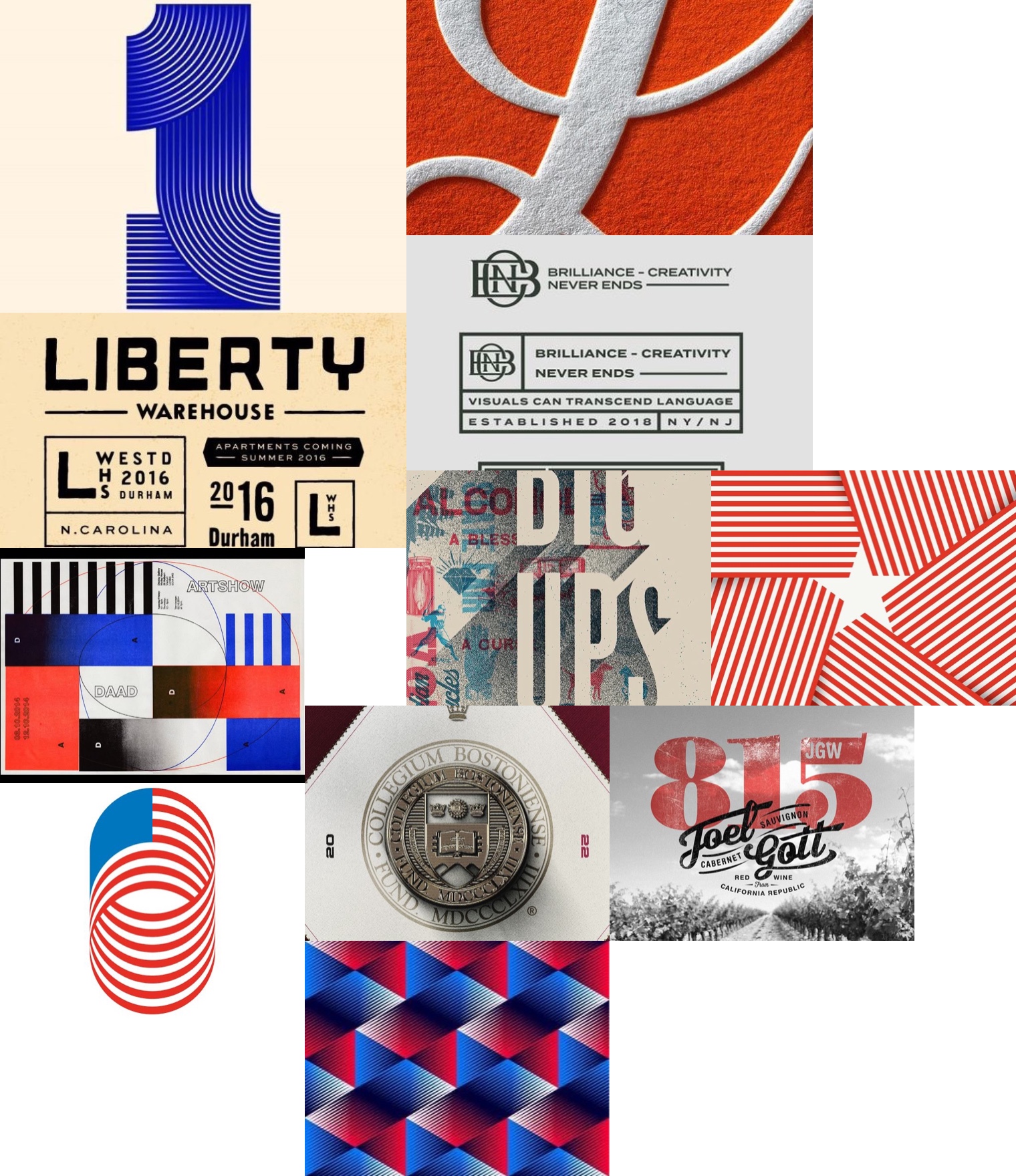
Design without purpose. The orange ampersand at 96.3% red, the blue striped numeral at 92.1% and the geometric 3D pattern at 97.2%, the single most rejected image, are formally accomplished and contextually empty. They exist as aesthetic objects rather than functional communications. Participants appear to require that American visual identity do something: certify, commemorate, represent.
Heritage cosplay. The Joel Gott wine label at 83.3% red references “California Republic” and depicts an American vineyard in vintage-styled type. It mimics the exact strategies that succeed in the resonance column. But it is selling wine, and participants detected this.
Generic corporate identity. HNB Brilliance at 96.4% and Liberty Warehouse at 86.7% use clean contemporary design that could belong to any company, anywhere. Their competent neutrality is precisely what disqualifies them. Foreign institutional markers. The DAAD poster at 87.0% is literally European. The Boston College seal at 79.2% represents an American institution in heraldic vocabulary, Latin text, ecclesiastical crowns, medieval shield, and reads as Continental. Visual grammar overrides geographic fact.
Resistance
The geometric pattern
Red, white and blue as pure decoration. Most rejected
97% redResistance
HNB Brilliance
Corporate identity that could be from anywhere
96% redResistance
The ampersand
A decontextualised letterform on orange
96% redResistance
DIG UPS
Chaotic collage, fragmented elements
94% redResistance
The blue numeral
Abstract striped typography
92% redResistance
The DAAD poster
A German cultural organisation, in Swiss grids
87% redResistance
Liberty Warehouse
Real estate branding in heritage type
87% redResistance
The abstract stripes
The flag stamp’s palette, with no stamp
84% redResistance
The wine label
California Republic in vintage script. Heritage cosplay
83% redResistance
The college seal
Latin, crowns and a medieval shield. Reads Continental
79% redResistance
The pill logo
A corporate form in red, white and blue
76% redThe whole study in two images
The most decisive verdict on each side of the line. One is a man rendered as what he stands for. The other is red, white and blue arranged to look good on a surface.
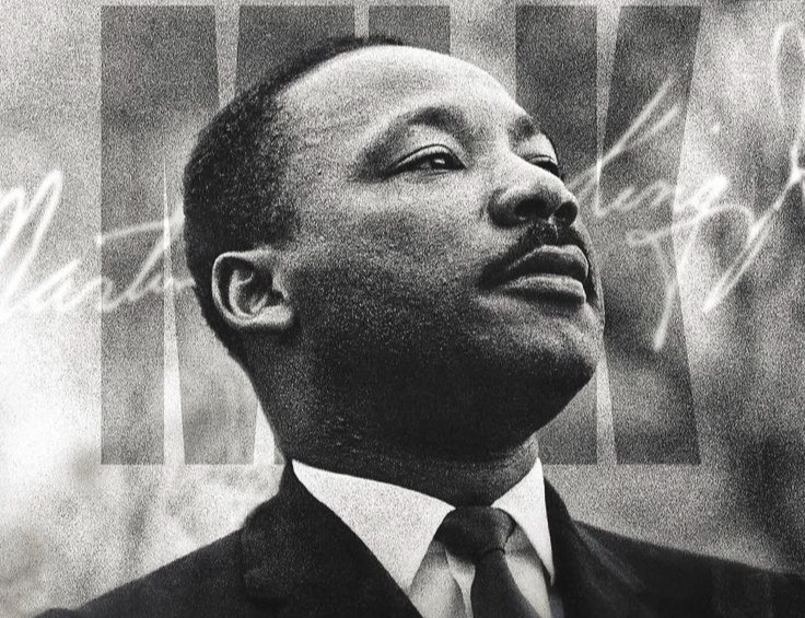
Same three colours. The room needed no instruction to tell which one meant something.
Same palette, different meaning
The cleaner pair is two abstractions of the same flag. The stamp is a stamp: it has civic function, institutional sanction, the implicit context of mail delivery. The stripes are purely decorative, and their decorative purpose strips them of national meaning. American-ness is not a property of visual elements. It is a property of what those elements are understood to be for.
Resonance
The flag stamp
The flag reduced to geometry, with a civic job
97% greenResistance
The abstract stripes
The flag reduced to geometry, with no job at all
84% redWhere America is contested
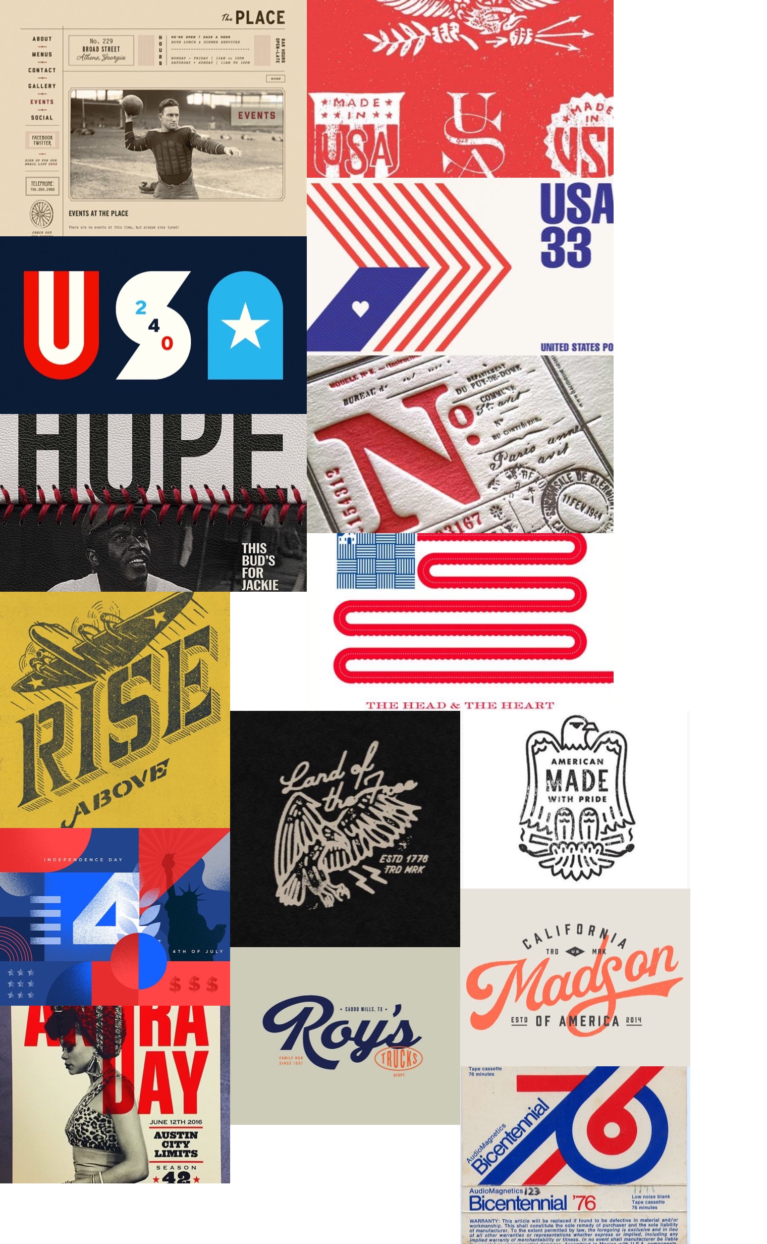
Fourteen images fell below threshold in both directions. They look at first like images that failed to register. They are the opposite: the images where participants actively disagree about what counts as American. The Andra Day Austin City Limits poster split the sample exactly in half. Compare that to MLK at 97% and the pattern at 97% red, where consensus was near-total. This is polarisation, not indifference.
The fault lines are legible. Historical versus contemporary Black culture: MLK resonated near-unanimously; Andra Day split the room. The “American” frame accommodates Black figures more readily as historical monuments than as living cultural producers. Regional specificity: Texas (Roy’s Trucks, 44.4%) and California (Madson of America, 42.9%) read as credential to some and provincial to others. Military nostalgia: the WWII Rise Above poster at 45.5% has every marker that wins elsewhere and divided the sample anyway. Sports: Jackie Robinson at 47.8% and the vintage football site at 35.7% are culturally American and ideologically muted.
Contested
American Made with Pride
An eagle badge that fell just short of the line
71% split · placed greenContested
USA 240
Modernist letterforms for a 240th birthday
70% split · placed greenContested
Bicentennial ’76
Cassette packaging from the bicentennial
61% split · placed greenContested
The badge collection
Made in USA marks, as a decorative set
54% split · placed greenContested
The Andra Day poster
Austin City Limits, split exactly in half
50% split · placed greenContested
Jackie Robinson
Baseball Americana, stitched leather and HOPE
48% split · placed greenContested
Rise Above
WWII aviation illustration, military nostalgia
46% split · placed greenContested
Roy’s Trucks
A Texas family business in script
44% split · placed greenContested
Land of the Free
Hand-drawn eagle, Est. 1776, on black
44% split · placed greenContested
Madson of America
California vintage script, established 2014
43% split · placed greenContested
The Place
A vintage football website in Athens, Georgia
36% split · placed greenContested
Head & Heart
The flag abstracted into a single red ribbon
33% split · placed greenContested
Letterpress No.
French postal aesthetic in red letterpress
30% split · placed greenContested
Independence Day
Modern geometric 4th of July, Liberty in silhouette
28% split · placed greenFor practitioners the contested constellation may be the most valuable output. The resonance column shows safe territory; the resistance column shows what to avoid. The middle shows where identity is being actively negotiated, where a design choice will resonate with some audiences and alienate others. Depending on the objective, that is exactly where to operate, or exactly where not to.
What to do with this
The underlying mental model is simple to state: American visual identity must be earned, not designed. Images succeed when they appear to emerge from American institutions, history or collective enterprise. They fail when they appear constructed for commercial or purely aesthetic purposes, even with identical elements. Commercial imagery has to borrow that authority, and the borrowing is detectable.
Do
- Frame it institutionally. USPS, Olympic and certification marks won because they are understood to serve a public purpose.
- Anchor to a specific moment. MLK, JFK, Memorial Day. Commemoration outperformed declaration every time.
- Give the image a job. Certify, commemorate, represent. American visual identity needs a reason to exist beyond decoration.
- Earn the provenance. A weathered mark that emerges from real manufacturing history scored 87.5%. Heritage styling on a new product did not.
- Choose the contested zone on purpose. Regional, military and sports imagery attracts one audience precisely because it repels another.
Don’t
- Don’t do heritage cosplay. Vintage type and distressed texture on a contemporary product read as simulated age: the wine label took 83.3% red.
- Don’t decorate with the flag. Stars, stripes and red-white-blue without narrative or institutional context read as empty appropriation, up to 97.2% red.
- Don’t go globally generic. Clean branding that could belong to any company anywhere fails to register as American regardless of palette: 96.4% red.
- Don’t borrow European heraldry. Latin, crowns and shields trigger Continental associations even for an American college.
- Don’t mistake the middle for indifference. A 50/50 image is an argument in progress, and a broad-appeal brand should stay out of it.
Methodology and confidence
Fifty-seven survey completions using dot-drag visual sorting on three boards of twelve, classified at a 75% threshold. The image set was assembled casually from Pinterest searches, which likely shaped the results: Pinterest surfaces imagery that already performs well in its own visual economy. The sample was a general audience without demographic segmentation. The civic-versus-commercial distinction showed strong consensus across many images and supports the core finding. Interpretations of the contested zone should be treated with caution at this sample size. One more thing the report noted: anchoring on the minority, the two participants who rejected JFK, revealed internally coherent alternative frameworks. The tool can surface latent audience segments through behaviour rather than self-report.
Frequently asked questions
What was tested in the “What does American look like” study?
Thirty-six images on three boards: posters, postage stamps, logos, packaging, editorial layouts and cultural ephemera, sourced from Pinterest searches for terms like “America branding” and “American graphic design.” Participants placed green dots on the images they most associated with “American” and red dots on the ones they least associated with it. The study ran June 27, 2025.
Who took part?
Fifty-seven completions from a general audience, without demographic segmentation, distributed primarily through LinkedIn. The civic-versus-commercial pattern showed strong consensus across many independent images, which is what gives the core finding its weight. The contested zone, where images sat near 50/50, should be read as directional at this sample size.
How do I read the three constellations?
Each image is classified by the share of its own dots that were green. At 75% green or better it sits in the resonance constellation; at 75% red or better, resistance; anything between is contested. The percentages on this page are shares of each image’s own crowd, not of all 57 participants. A contested image is not one people ignored. It is one they disagreed about.
Why did some patriotic designs score so badly?
Because colour and style were not what the audience was sorting on. The geometric red-white-blue pattern took 97.2% red and the abstract stripes 84.2% red while a flag stamp in the same palette took 97.2% green. The stamp has a civic job. The pattern decorates. Participants required American imagery to certify, commemorate or represent something, not merely to look the part.
What does this mean for a brand that wants to look American?
Purpose beats palette. Institutional framing, historical anchoring and earned provenance carried the winners; heritage cosplay, decontextualised flag elements and globally generic design carried the losers. Before committing to an Americana direction, test it with a real audience, because the difference between standing for something and selling something is visible to them even when it is invisible to the design team.