
How the study worked
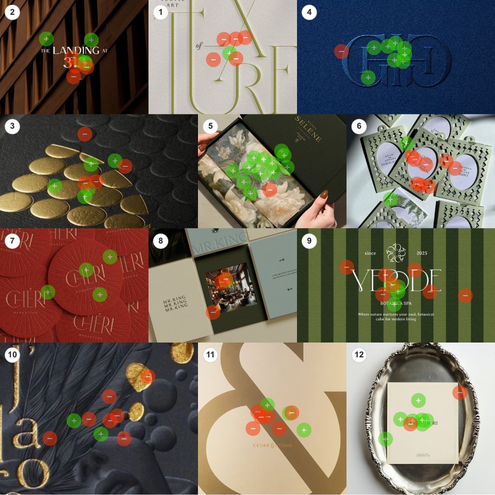
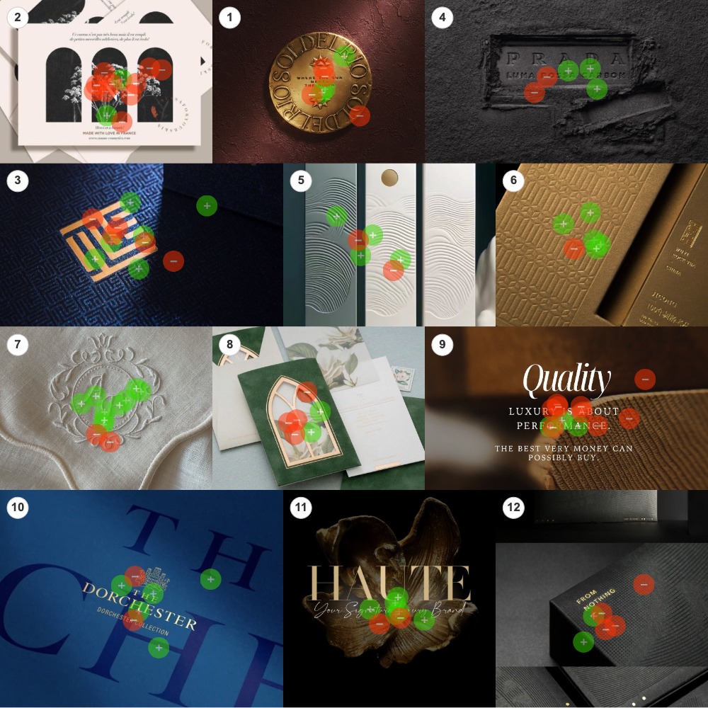
Two boards, twelve images each. Packaging, stationery, monograms, hotel marks, fragrance, editorial type, all of it luxury-adjacent, mixed together with no grouping and no order. Nineteen people got green dots and red dots and one prompt: green on the images you most associate with the idea of elevated, red on the ones you least associate with it.
They placed 199 dots, 102 on Board 1 and 97 on Board 2, and the heat maps above are the raw result before any sorting. Both boards ran the identical prompt, so the same pattern had to appear twice, independently, to count. It did.
At the study’s 65% threshold the 24 images fall into three groups. Nine cleared the bar as elevated, nine crossed it as not elevated, and six split the room. See the full report for every score. What follows is what each group has in common.
The one variable that decided everything
The divide does not track with quality, material richness or restraint. It tracks with whether the image’s visual vocabulary feels inherited or authored. The winners speak the language of pre-modernist European luxury and its parallels in other cultures: parfumerie monograms, hotel crests, embossed heraldic lockups, classical heritage traditions. The losers, even when genuinely high-craft, read as a contemporary designer’s decision about luxury.
The implicit period is roughly 1880 to 1925: Belle Époque parfumerie, grand hotels, Italian textile, French stationery. The tradition does not have to be European. The Wuyi Rock Tea box reads as classical Chinese heritage and resonates just as well. Heritage is the operative term, not Eurocentrism. What matters is depth of lineage, rendered with restraint.
Figure 1 · Every image, ranked
Principal finding
The opposite of elevated is not unrefined. It is self-aware. Several rejected images are technically excellent: foiled, debossed, restrained, beautifully set. They fail because the design feels authored. The winners succeed because they read as inherited. Adding more restraint or more ornament rarely closes the gap. Reaching for the codes of inherited luxury does.
What won: the mark that has always been there
Nine images cleared the 65% threshold, and they share a vocabulary: monograms, heraldic ciphers, embossed brand artifacts, ornamental serif lockups, foil-stamped names on dark grounds, embroidered initials. The brand is almost always present as a printed or wrought object, not as a layout. It is a thing you would touch.
The palette is restrained and two-colour with a metallic accent. Navy and gold, cream and gold, deep green and gold, gold on gold. The white-on-white embroidery is the lone outlier, and it succeeds for the same underlying reason: a single-tone tactile mark. Nothing strives. The mark sits on its substrate the way it has always sat.
Resonance
The Chéri coasters
Letterpressed coasters, an Art Deco lockup on red
100% green · 4 of 4 dotsResonance
The Maison Selene box
Painted florals inside a deep green box, gold-stamped name
92% green · 12 of 13 dotsResonance
The embossed monogram
A heraldic cipher pressed into navy felt
89% green · 8 of 9 dotsResonance
The Wuyi Rock Tea box
Gold-on-gold debossing, classical Chinese heritage
83% green · 5 of 6 dotsResonance
The embroidered cipher
White-on-white initials inside an ornamental flourish
82% green · 9 of 11 dotsResonance
The card on the tray
An Italian heritage card set on a baroque silver tray
78% green · 7 of 9 dotsResonance
The gold serif on bronze
A gold serif over a sculpted bronze flower
75% green · 6 of 8 dotsResonance
The Dorchester mark
A gold serif lockup on deep navy
71% green · 5 of 7 dotsResonance
The relief panels
Sculptural wave relief in white, no type at all
67% green · 4 of 6 dotsThe viewer is expected to recognise the codes
Nothing in this array is being sold. The Maison Selene box, the card on the silver tray, the Dorchester gold-on-navy, the Wuyi debossing: each shows the brand as an object with a history, and the viewer is expected to recognise the tradition rather than be persuaded of it. That is what inherited looks like on a board.
What lost: design that shows its hand
Nine images crossed the 65% negative threshold. They are not unified by a single aesthetic. They fail in distinct ways, but every failure involves the design making itself visible as design.
Editorial drama and small formats
The Subtle Art of Texture letterpress uses the same kind of serif, the same paper stock and the same restraint as several winners. It fails because the type is enlarged to bleed off the page in magazine style. That reads as a creative spread, not a brand artifact. The postcard-tier composition on Board 2 drew the largest crowd on its board and lost it.
Resistance
The editorial serif
Letterpressed type blown up to bleed off the page
83% red · 5 of 6 dotsResistance
The postcard set
Small-format stationery, postcard-tier composition
83% red · 10 of 12 dotsOccasion vocabulary and stacked signifiers
Two pieces use the language of wedding invitations: calligraphic name pairs, cutout windows, foil and florals. The materials are luxurious. The category cues are wrong. The J’ao composition piles black, gold, feathers, lips, bubbles and foil into one frame, and the maximalism reads as trying.
Resistance
The wedding invitations
Calligraphic name pairs with cutout frames
80% red · 8 of 10 dotsResistance
The stacked signifiers
Feathers, foil, lips and bubbles in one frame
78% red · 7 of 9 dotsResistance
The gold cutout window
Wedding stationery with a foil-edged arch
67% red · 4 of 6 dotsContemporary minimalism
This is the most surprising failure mode. Cedar & Stone and FROM NOTHING are technically excellent: gold foil on cream, gold foil on debossed black, geometric typography, exquisite restraint. They fail because their visual language is post-2010 minimalist luxury, not pre-1925 heritage luxury. The craft is equivalent. The dialect is wrong.
Resistance
Cedar & Stone
A modern geometric ampersand in gold on cream
67% red · 6 of 9 dotsResistance
FROM NOTHING
Sans-serif gold foil on a debossed black box
67% red · 4 of 6 dotsNarrative and declaration
Mr. King tells a hospitality story across multiple cards, and the narrative ambition reads as creative concept, not establishment. The Quality piece literally says luxury is about performance, with a typo. Saying it disqualifies it.
Resistance
Mr. King
A multi-card hotel brand story
75% red · 3 of 4 dotsResistance
The luxury declaration
Serif type announcing luxury, typo included
75% red · 9 of 12 dotsVerbal declaration
When a brand has to use the word luxury in its layout, it has already lost the read. Real elevation does not announce itself. The artifact carries the message; the message cannot describe the artifact.
The whole study in two images
The cleanest pair on the boards is two pieces of letterpress. Same serif family, same premium paper, same restraint. One is a contained lockup. The other is a headline that does not fit the page.
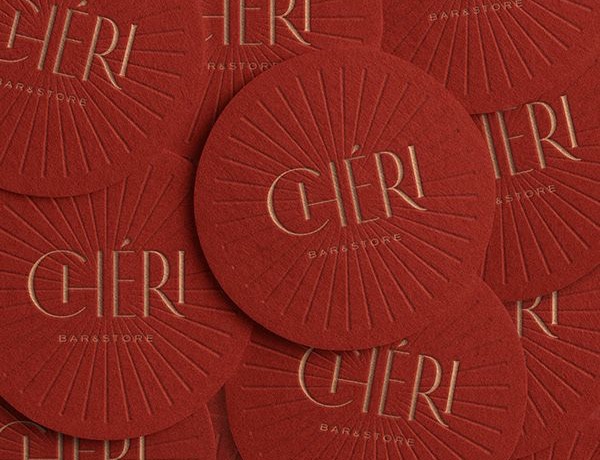
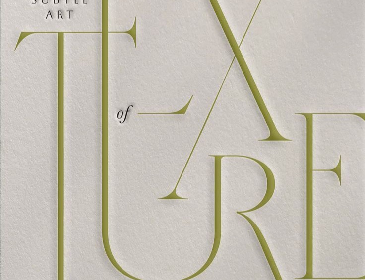
One is a brand artifact. The other is a magazine spread. The room needed no instruction to tell them apart, and the typeface never changed.
The six images that split the room
Six images landed between 36% and 60% green, and each contains a mix of heritage and contemporary cues. Verde Botanica has a heritage serif and a small crest, but the green stripes and the modern-living tagline pull it into spa territory. Sol del Rio attempts a heritage coin and the rough plaster wall dilutes it. The ML cipher is a hair’s breadth from resonance; the geometric maze pattern is the contemporary cue holding it back. Most striking, Prada Luna Rossa Carbon is real luxury and still does not cross the threshold, because ash and charcoal code as masculine fragrance, fighting the prompt.
Contested
Prada Luna Rossa
Real luxury in a masculine, edgy register
60% split · 3 of 5 dots greenContested
The Landing at 312
Heritage type over a contemporary photograph
56% split · 5 of 9 dots greenContested
The gold seeds
Gold seed shapes on black, material strong, mark absent
56% split · 5 of 9 dots greenContested
The ML cipher
A foil monogram inside a geometric maze pattern
55% split · 6 of 11 dots greenContested
Sol del Rio
A heritage coin idea on rough plaster
43% split · 3 of 7 dots greenContested
Verde Botanica
Heritage serif and crest, contemporary spa cues
36% split · 4 of 11 dots greenThe neutrals tell one story. When heritage cues dominate completely, the image resonates. When even one strong contemporary cue intrudes, it goes neutral. When contemporary cues dominate, it is rejected.
What to do with this
If the brief is to project elevated in the sense these participants read it, the moves below close the gap faster than any general appeal to restraint or quality.
Do
- Set a serif with classical character. Ornamental capitals, ligatures, slightly old-fashioned proportions. The most consistent signal in the winning array.
- Build a monogrammatic lockup. A cipher, a heraldic mark, an interlocking initial pair. It reads as inherited identity, not a contemporary brand mark.
- Hold two colours plus a metallic. Navy and gold, cream and gold, deep green and gold. The metallic earns the second colour, not a third one.
- Show the brand as a tactile artifact. Foil-stamped card, debossed box, embroidered cipher, embossed monogram, photographed in soft directional light.
- Borrow pre-modernist heritage, even in pastiche. French parfumerie, grand hotel, Italian textile, classical Chinese. Even when the brand is new. Even when the references are composite.
Don’t
- Don’t run geometric sans at large scale. Even at high craft it codes as contemporary minimalist luxury, which this room did not read as elevated: 66.67% red, twice.
- Don’t bleed editorial type off the page. It reads as a magazine spread. The same typeface in a contained lockup scored 100% green.
- Don’t borrow wedding stationery. Calligraphic name pairs, cutout windows, foil-edged florals. Occasion cues fight the brand read even with luxurious materials.
- Don’t say the word. Verbal claims of luxury or quality disqualify the piece. 75% red, with the typo.
- Don’t stack signifiers. Gold, foil, feather, bubble, script and serif in one frame reads as overdesigned. One strong material signal beats five.
One warning before you run with this
This map is specific to the word elevated, which implies a having-risen-already that lines up with inherited status. Premium, refined or discerning would likely shift it, with more tolerance for contemporary minimalism. This panel also skewed designer-curious; a panel of finance or fashion buyers might place Cedar & Stone and FROM NOTHING higher. Confirm the word before you build the system.
Methodology and confidence
Fielded in February 2026 across two boards under the same prompt. 19 participants completed the survey out of 42 who opened it, placing 199 dots across 24 images, 102 on Board 1 and 97 on Board 2, classified at a 65% threshold. Per-image crowds ran from 4 to 13 dots.
At n = 19 this study sits in the pattern-emerging band, not the strong-consensus band. Individual swatch readings are directional. The cross-image pattern holds on both boards independently, which is why the dimensional claim, inherited against authored, carries more weight than any single score. The sharpest claim, that contemporary minimalist luxury specifically codes as not elevated, rests on a small number of swatches and warrants a follow-on panel of more than 60.
Frequently asked questions
What was tested in the Elevated study?
24 pieces of luxury branding across two boards of twelve: packaging, stationery, monograms, hotel marks, fragrance and editorial type. Nineteen participants placed green dots on the images they most associated with the word elevated and red dots on the ones they least associated with it, 199 dots in total, sorted at a 65% threshold.
What does “92.31% green” actually mean?
It means 92.31% of the dots placed on that image were green rather than red. The Maison Selene box drew 13 dots and 12 of them were green. The figure is a share of that image’s own crowd, not of all 19 participants, so a decisive image with a small crowd and a decisive image with a large crowd both read at full strength.
How do I read the heat maps?
Each green mark is one participant saying this reads as elevated. Each red mark is the opposite. Where the marks cluster is attention; the colour of the cluster is the verdict. An image with both colours mixed together, like the ML cipher, is one the room could not agree on.
Is nineteen people enough to act on?
For the direction, yes. The same pattern, heritage against contemporary, appeared on both boards independently, and several verdicts were unanimous or near it. For any single image the crowd is 4 to 13 dots, so treat individual scores as directional and validate the sharp claims with a larger panel before betting a brand system on them.
What does this mean for my brand?
If your brief says elevated, reach for the codes of inherited luxury: a classical serif, a monogrammatic lockup, two colours plus a metallic, the brand shown as a tactile object. If your brief says premium or modern, expect a different map. The word in the brief is the variable, so test the word.